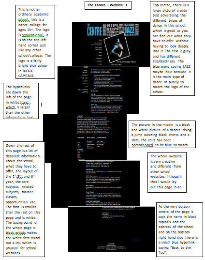
I really liked this website because I thought that the a-z list of drugs was very clever and I liked the layout. I thought the colours and artistic aspects were very eye catching and pulled me in from the first glance at the homepage.
Tuesday, 10 May 2011
Change 4 Life Research
I found this website very interesting because it has the same kind of intention as my main website. The bright colours caught my eye straight away and I liked the way the pictures are all cartoons appealing to young children.
Wednesday, 20 April 2011
Final marking
Nicola, your research and planning is quite good, and you are fairly close to your target mark. You must download the checklist and go through it thoroughly, please, and make sure you have attended to the details. The website has some glitches that we need to sort out (links!).
HM
Tuesday, 5 April 2011
Webpage Designs
Thursday, 17 March 2011
Wednesday, 16 March 2011
Wednesday, 9 March 2011
Tuesday, 8 March 2011
Idea design for our website
This is a brief idea for our website. We decided bright colours attract peoples attention and draws them in. The logo get fit get happy basically explains the website. If people get up and exercise and make a change to their daily routines they will live a happier lifestyle.
Thursday, 3 March 2011
Preparation and Planning posts
This is the link to the page with everything for Planning and Preparation: this is 20% of your mark, ie two whole grades.
http://web.me.com/morrmedia/MORRMEDIA/Website_planning_and_preparation_list.html
Make sure everything is ticked off. There are also lists on the wall in the media room.
On Monday you should have shotlists, storyboard (for your video), survey completed, six annotated pages completed.
HM
Tuesday, 15 February 2011
Bits to do
Hi Nicola: these are the bits for you to catch up on -
Survey. You need to have about ten people answer your survey and post the results.
Draft brief for preliminary site.
Draft brief for preliminary site.
You'v e made up a lot of ground, well done. The red haired girl is really dynamic and interesting, and you have a touch with the graphics that you must exploit as much as you can.
Good work.
Wednesday, 9 February 2011
School Website Idea Draft
 |
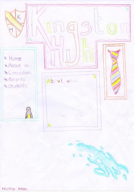
| This is my media page, it is basic however with information there would be more of a layout with text and pictures, but that is my basic brief idea. |
Main Website
Ideas
For this website I will be working with Lisa Crochane. My idea for our campaign website is to have a health campaign. We want to get the nation moving, listening to music and dancing, lifting their spirits and getting them off the sofa to enjoy a great activity that will enhance their lifestyle. Exercise burns calories and if they can find something they can enjoy they will live a longer and healthier life. This is will also potentially save money for the NHS.
The NHS would promote this website as it will help them in financial ways, the NHS already do a similar promotion however this website will be bolder and aesthetically pleasing, it will get people involved.
Tuesday, 8 February 2011
Kingston High Website Survey
Monday, 7 February 2011
Photoshop
School Website Research
Monday, 31 January 2011
Come on Nicola!
There's just a bit to be done on your blog . . . it would really help if it was all posted and up to date! Come on, then!
HM
Tuesday, 25 January 2011
The list -
Nicola
Please post the list of work that you should have on your blog - everything from 13th January, up to today.
Creating your blog.
Using a camera introduction
Photoshop your picture/s and post to blog.
Research on four school websites: 400 words short essay.
Survey.
Catchup, including survey, annotated websites.
Draft brief for preliminary site.
Page layout.
Photoshop, first artwork.
HM
Subscribe to:
Comments (Atom)


