Tuesday, 15 February 2011

Bits to do

Hi Nicola: these are the bits for you to catch up on -

Survey. You need to have about ten people answer your survey and post the results.
Draft brief for preliminary site.

You'v e made up a lot of ground, well done. The red haired girl is really dynamic and interesting, and you have a touch with the graphics that you must exploit as much as you can.
Good work.
Wednesday, 9 February 2011

School Website Idea Draft

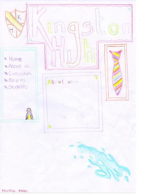
In this lesson we drew out our ideas for the homepage of our own made up school website. We also had to draw our ideas for the Media page. My media page is basic however with information there would be more of a layout with text and pictures.
This is my media page, it is basic however with information there would be more of a layout with text and pictures, but that is my basic brief idea.

Main Website

Ideas

For this website I will be working with Lisa Crochane. My idea for our campaign website is to have a health campaign. We want to get the nation moving, listening to music and dancing, lifting their spirits and getting them off the sofa to enjoy a great activity that will enhance their lifestyle. Exercise burns calories and if they can find something they can enjoy they will live a longer and healthier life. This is will also potentially save money for the NHS.
The NHS would promote this website as it will help them in financial ways, the NHS already do a similar promotion however this website will be bolder and aesthetically pleasing, it will get people involved.

Tuesday, 8 February 2011

Kingston High Website Survey

We had to make a small audience survey for parents of children enrolling at Kingston High. This is my survey.

Monday, 7 February 2011

Photoshop

We were introduced to photo editing using a program called photoshop. We edited out photos so we convey the messages of the picture in an more artistic way. This is a photo I took of my cousin. I have edited it to enhance her natural red hair colour to show that she should be proud to be a natural red head in a society that discriminates against small minorities, and the blueness of her eyes to show purity and innocence.

School Website Research

The Ravensbourne School Website. I have found that this website is square, at the logo is on the top right hand corner. Underneath is the hyperlinks for each page. There are three columns, the first column has a picture, middle column has the news of the school and the third column is hyperlinks to different websites that link with the school such as Childline. 

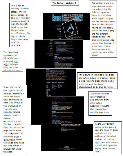
The Centre this website is also square, it is a lot longer than the other websites because it holds more information on the homepage. In the top left hand corner is the name of the school, the logo is top centre of the page, underneath is a picture showing the type of school, a dance school. There are no columns in this page but going down the left of it are the hyperlinks for the different pages. The font is white on a black background.

Langley Secondary School. This website is square but is only one page, there is a plain red background and on that is a smaller box with the actual website holding the information of the school, in the top left hand corner is the school logo and the name of the school on the top left hand corner is a search bar. Underneath going across is the hyperlinks of the pages. In the centre of the page in a brief introduction of the school, around it are different pictures and various videos about the school and the kind of things the school take part in. Underneath are more hyperlinks going across of different educational websites.